Interface try-out about "how to manage profiles' access"
Client
ChainTraced offers a SaaS solution that automates the administration and distribution of product certificate data.
Mission
Mission
The client wished to update their user interface in order to improve the user experience and be able to add new features.
Project description
Project description
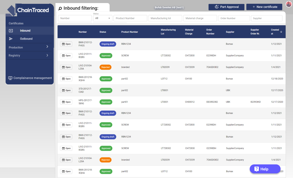
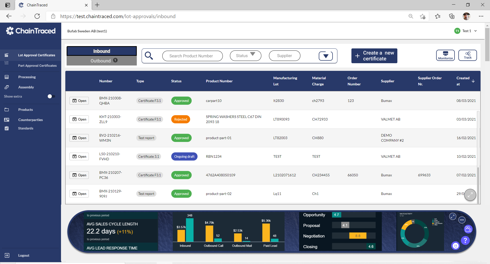
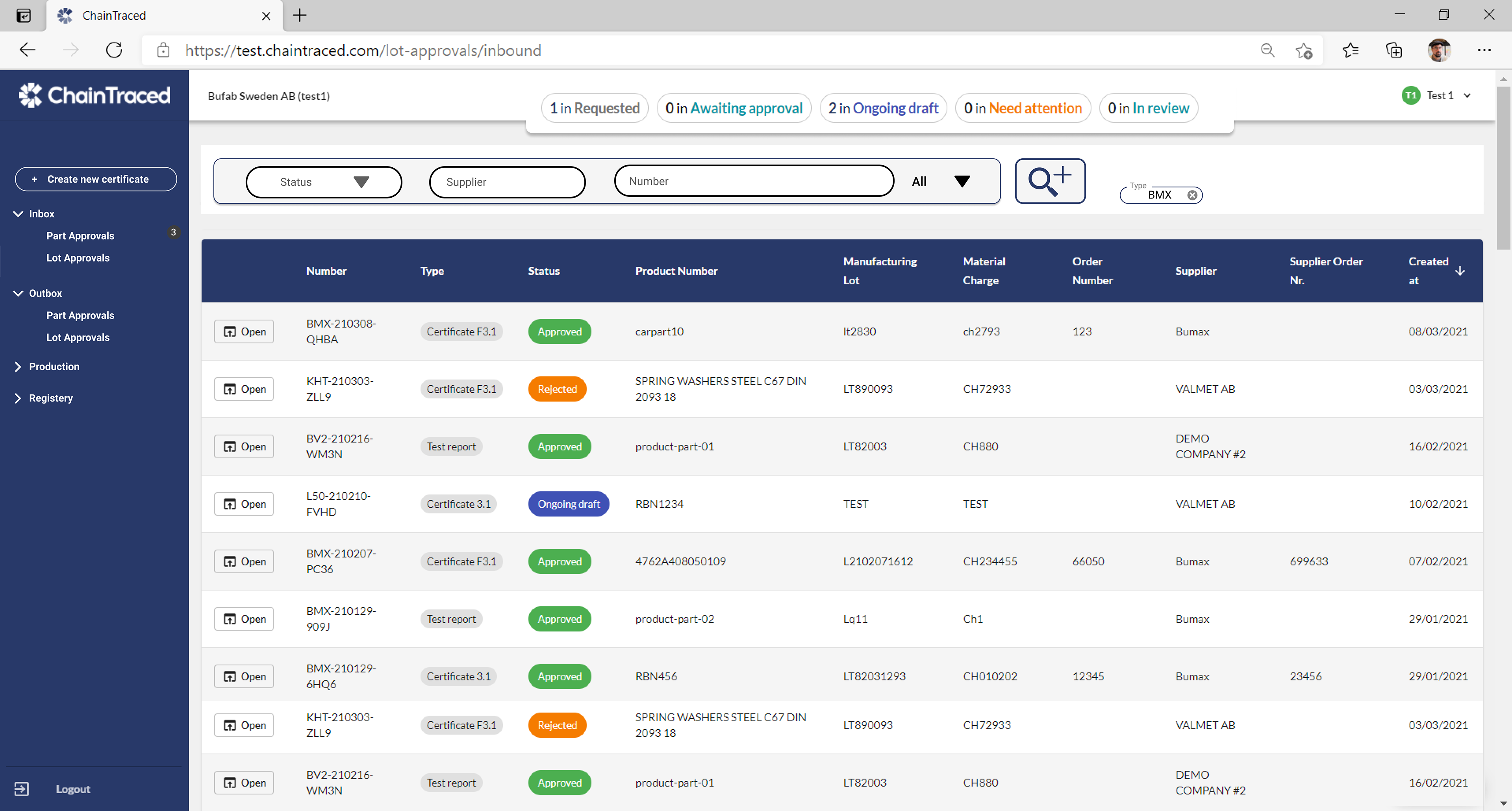
I analyzed the company’s current user interface, as well as the UI of other market players, and proposed a range of different design suggestions for the client. I also designed prototypes for new features that the client wished to develop soon.
The original interface of Chaintraced
One of the interface tests having the menu on top.
The process
I started by researching the client's user interfaces as well as those of other market players and industries such as email and backing software.
To support the design process, I suggested the client to define user personas. For that purpose, I facilitated a workshop with my colleagues, during which we analyzed the characteristics of 3 different archetypical users.
After this research, I started the design process. I invested plenty of time in looking for new ways to organize the buttons and functions of the service like the images on top, and, while designing other product interfaces that would be developed.


The solution
I starded to try ou the menu on top; in black; with a search icon and a dossier inspiration filtering, and a semi-logotype on the top of the list. You can also see the other selected three design suggestions here on top.
During my time with ChainTraced, I also designed new pages for new features that the company was planning to develop.
These design suggestions were used to pitch the features to both clients and investors, as well as a blueprint for the developers.
This is an interactive prototype about "how to add documents and info" made in Figma, and then, converted to GIF.